How To Create A Responsive Navigation Menu (hamburger)with Javascript
I am a Frontend developer who is passionate about setting a pace in the world of technology, I also love to express my knowledge through My writing skills.
Introduction
Sidebars are additional information placed to the right or left of the main content area of a webpage. They are used in displaying several or more items of information to users.
In this article, I will show you significant steps to easily create responsive sidebar navigation (Hamburger) using HTML, CSS, and JavaScript.

The horizontal display of the sidebar seems to be old-fashioned. Before the advent of the new design, we built these menus to display the sidebar horizontally. Still, now designers have ditched the horizontal .nav-bar. to be used vertically using icons or animation effects to allow it to be tweaked by the users.
One good advantage of hamburger is that it makes the navigation experience very easy and less choky on a website or application. It also helps with screen spacing when .nav elements are hidden. However, its limitation is that it hides specific information, making users struggle to navigate your web app. For this reason, it often gets a low click rate.
Let's get started...
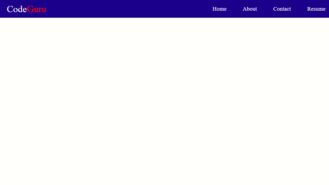
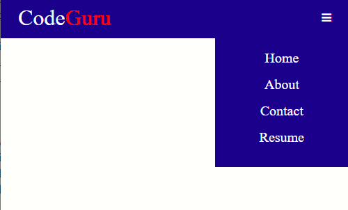
The Navigation Bar consists of logos and a list of links to the main pages of a web application. The sidebar is usually displayed on screens wider than 990px, and we would hide it on small screens. It's just like when we open a website on our computer, it displays our logo and links to different pages on that website, but when we have a small screen like our mobile phones, we will hide the sidebars inside a hamburger icon. When we click on the icon, it displays our sidebars. If we click again, our sidebar disappears.
Structuring Our HTML File
Then we create a folder for our project and open our favorite text editor (visual studio code, sublime text, etc.). Depending on individual preference, I prefer using the VS code editor. I have my CSS adequately linked. Then I added a couple of extensions to my folder (Font Awesome CDN), and I gave my project the title of CodeGuru.
See it yourself…
Create index.html file and add the following HTML code inside it
<html lang="en">
  <head>
    <meta charset="UTF-8" />
    <meta http-equiv="X-UA-Compatible" content="IE=edge" />
    <meta name="viewport" content="width=device-width, initial-scale=1.0" />

    <link rel="stylesheet" href="style.css" />
    <link rel="stylesheet" href="font-awesome-4.7.0/css/font-awesome.min.css" />


    <title>CodeGuru</title>
  </head>

  <body>
    <header>
      <div class="nav-bar">
        <a href="#" class="nav-coding">Code<span class="Guru">Guru</span></a>

        <ul class="nav">
          <li class="nav-items">
            <a href="#" class="link">Home</a>
          </li>

          <li class="nav-items">
            <a href="#" class="link">About</a>
          </li>

          <li class="nav-items">
            <a href="#" class="link">Contact</a>
          </li>

          <li class="nav-items">
            <a href="#" class="link">Resume</a>
          </li>
        </ul>
        <div class="bar">
          <i class="fa fa-bars"></i>
        </div>
      </div>
    </header>

    <script src="index.js"></script>
  </body>
</html>
CSS
See it yourself...
Create your CSS file as Style.css, link it to your index.html file, and add the following code inside it.
*{
    padding: 0;
    margin: 0;
    box-sizing: border-box;
}
header{
    background-color: #00008b;
}
li{
    list-style:none;
    font-size: 1.2rem;
}
a{
    text-decoration: none;
    color: #ffffff;
}
.Guru{
    color: red;
}
.nav-bar{
    display: flex;
    min-height: 60px;
    align-items: center;
    justify-content: space-between;
    padding: 0px 25px;
}
.nav{
    display: flex;
    text-align: center;
    justify-content: space-between;
    align-items: center;
    gap: 55px;
}
.nav-coding{
    font-size: 2rem;

}
.link{
    transition: 0.8s;
}

.link:hover{
    color: #f30707;
}

.bar, .fa-bars{
    color: #ffffff;
    display: none;
}
.bar, .fa-bars,.fa-times{
    display: none;
}
.Menu-bar{
    display: block;
    height: 5px;
    width: 25 px;
    background-color: #ffffff;
    -WebKit-transition: all 0.2s ease-in-out;
    -WebKit-transition: all 0.2s ease-out;
    margin: 5px auto;
}
@media(max-width:700px){
    .bar, .fa-bars{
        color: #ffffff;
        display: block;
    }
    .nav{
        display: block;
        background-color: #00008b;
        position: absolute;
        right: 0;
        top: -4;
        margin-top: 10%;
        padding: 1rem 4rem;
        display: none;
    }
    .nav-items{
        font-size: 20px;
    }
    .nav-items{
        margin: 15px 0;

    }
    .fa-times{
        display: none;
    }
    .active{
        display: block;
    }
}
JavaScript
Using Javascript, we'll add some functionality to our hamburger icon.
Firstly, you need to link your JavaScript page with your HTML page.
Then I called out two querySelectors ( .bar and .nav, respectively), and then I added an event listener that should toggle when the Hamburger icon is clicked to switch state and display the bar menu.
See it yourself…
Create a script file called index.js and add the following code inside it.
const bar = document.querySelector(".bar");
const nav= document.querySelector(".nav");

bar.addEventListener("click",() => {
    bar.classList.toggle("active");
    nav.classList.toggle("active");

})

document.querySelectorAll(".link").forEach(n => n.
    addEventListener("click",() =>{
        bar.classList.remove("active");
        nav.classList.remove("active");
    }))
The Desktop View
The Mobile view

The Output of The Mobile View When Clicked
Conclusion
Now that we have completed our hamburger menu, I hope you see the difference between the old-fashioned way of creating the menu bar and the latest design, which is the hamburger. I hope you like it. Stay tuned for more updates on Frontend Development.


